Trinity Mobile Networks
Rebranding connectivity
2014–2015
Trinity Mobile Networks’ mission is to bring fast, reliable, and inexpensive mobile access to the world.
They believe in the transformative power of the internet and its ability to better individuals and communities. Until recently their primary focuses were in the BtoB space, but as the company grew and approached the launch of its first consumer product Jumpnet, Trinity Mobile Networks saw the need for a refreshed and standardized brand. I joined the company in fall 2015 and we undertook a rebranding that winter.

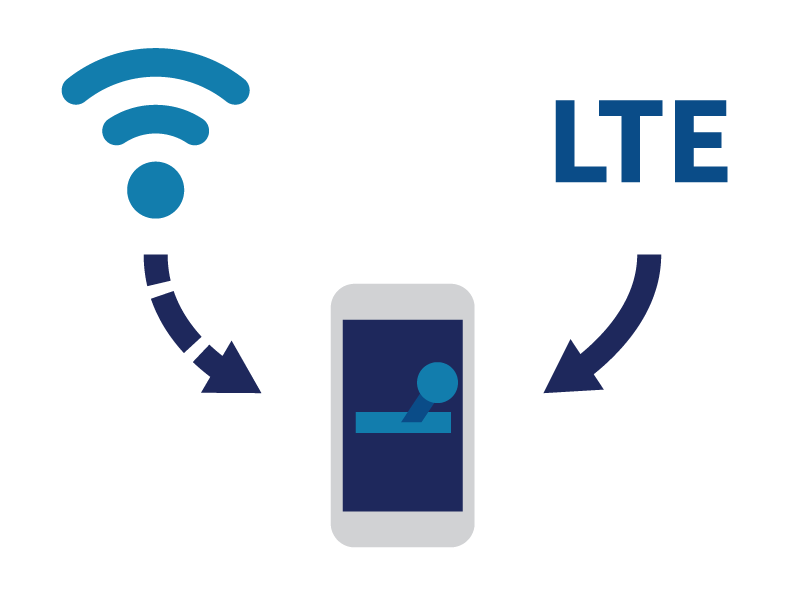
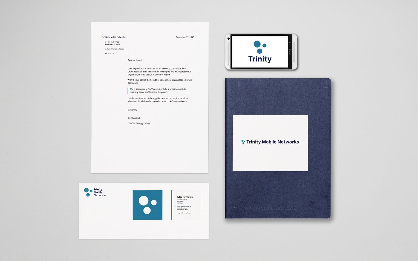
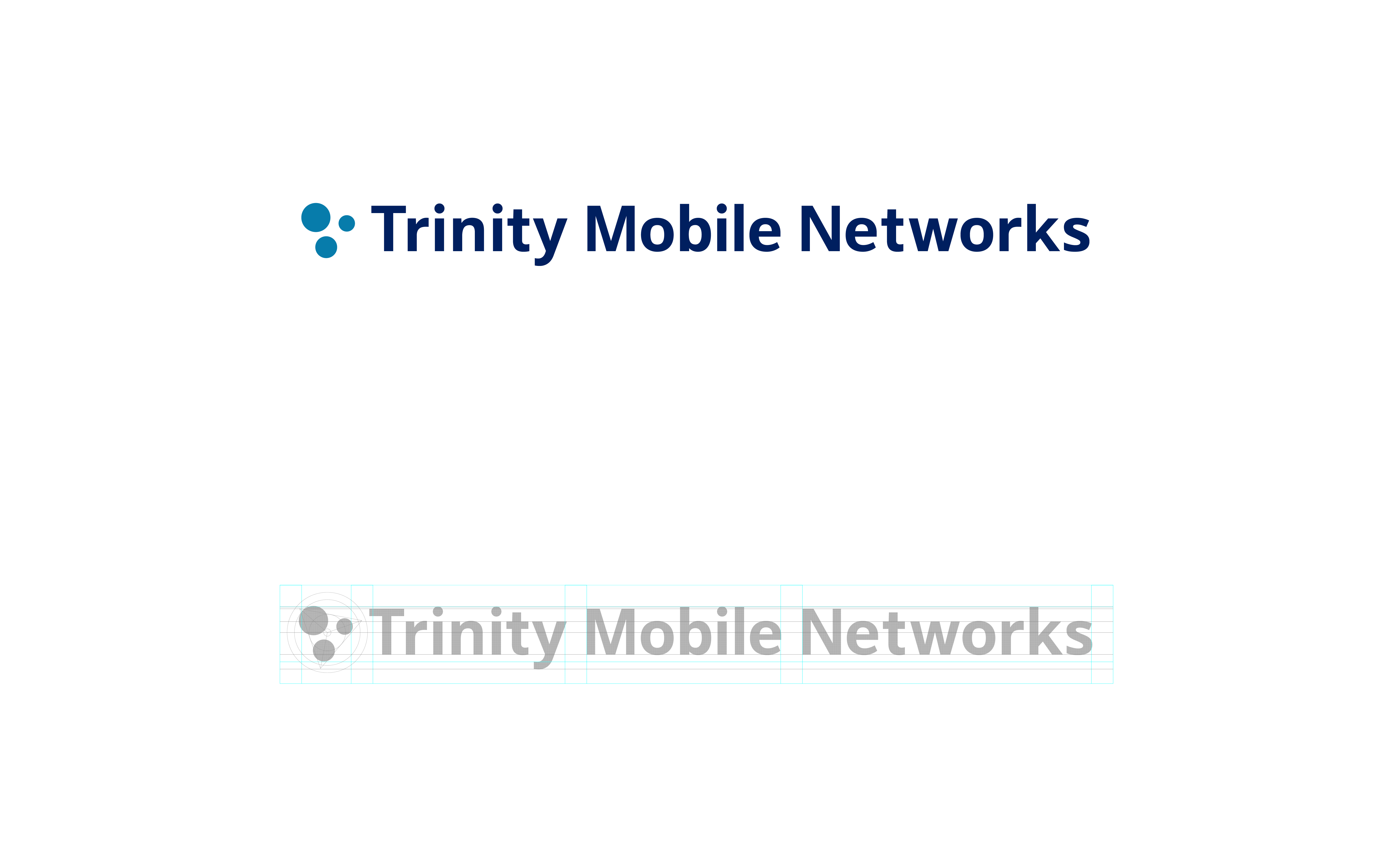
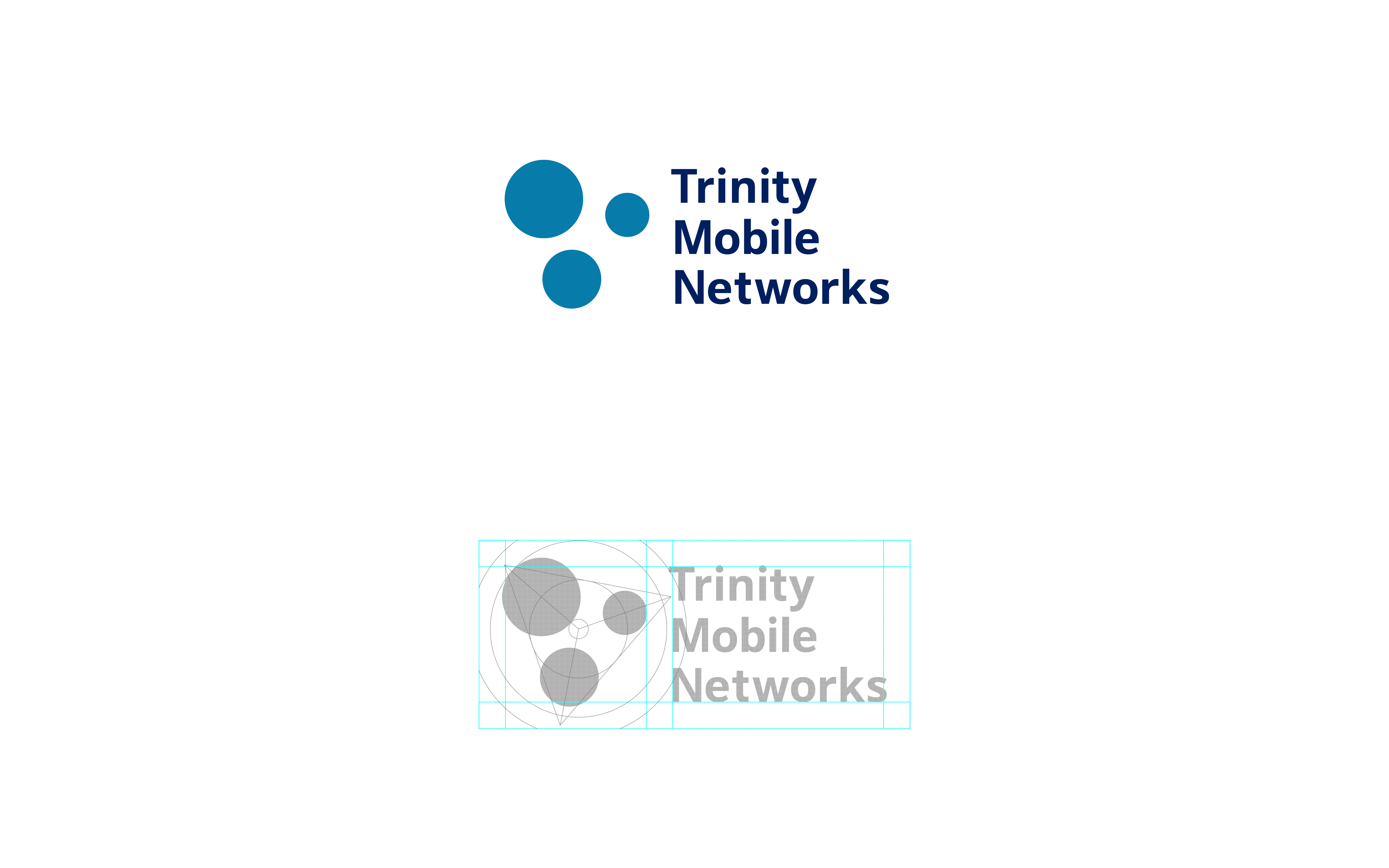
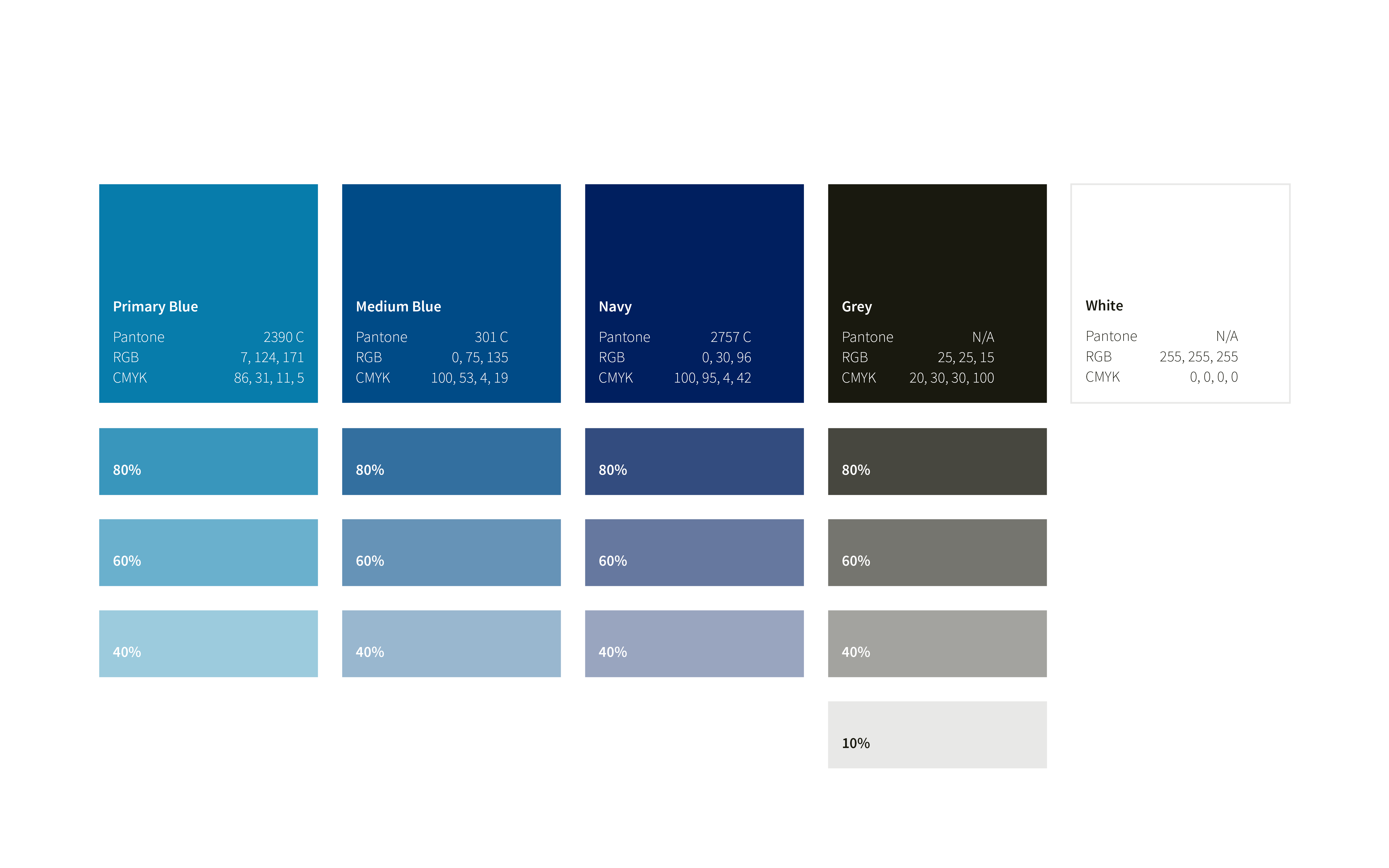
The Trinity mark and name represent the company's technology: bringing cellular, Wi-Fi, and mesh wireless together into one network. The shapes of the old mark are echoed in the new, but are simplified and abstracted for impact and universality. The colors too are similar, but are expanded beyond the old palette's singular blue.
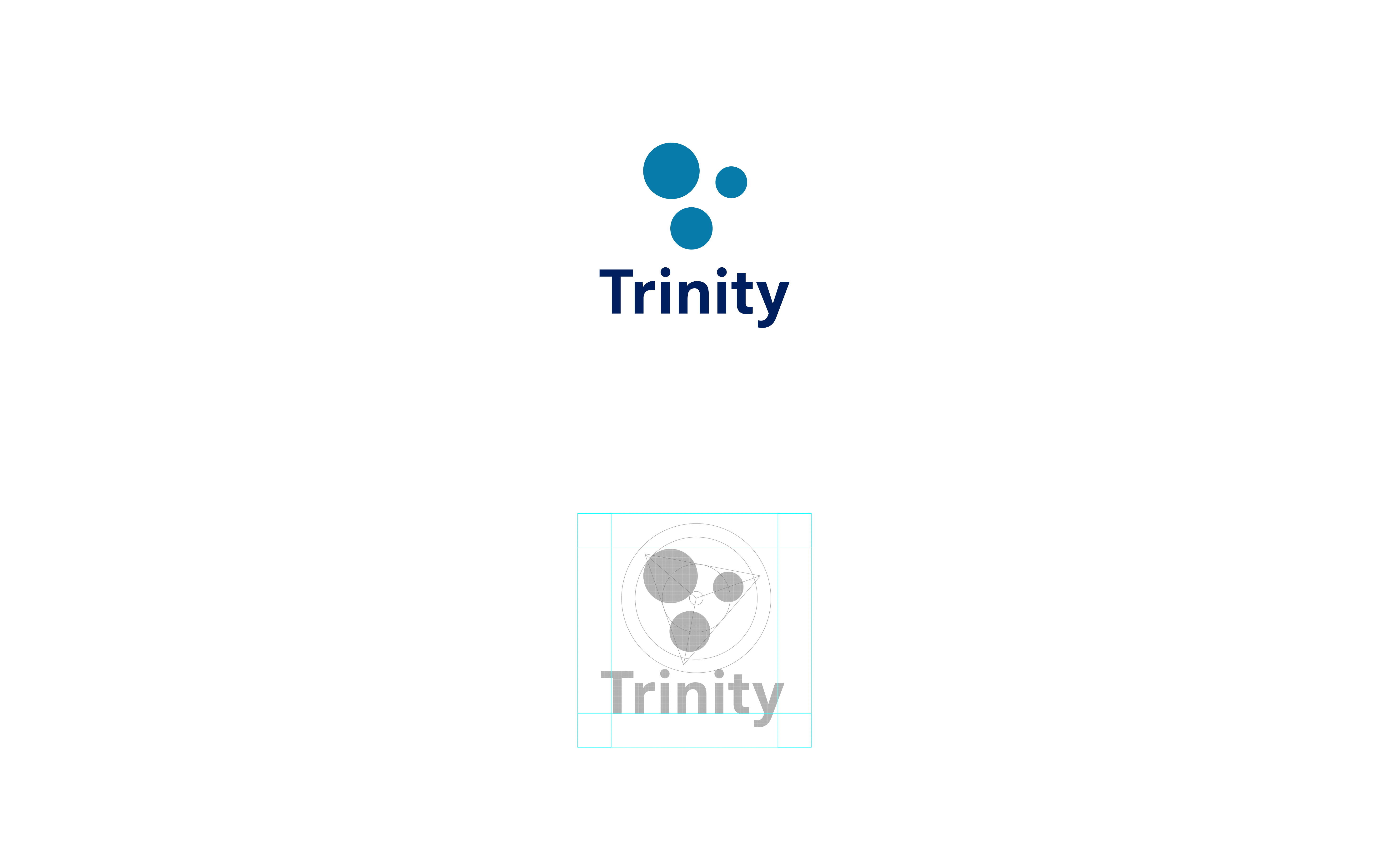
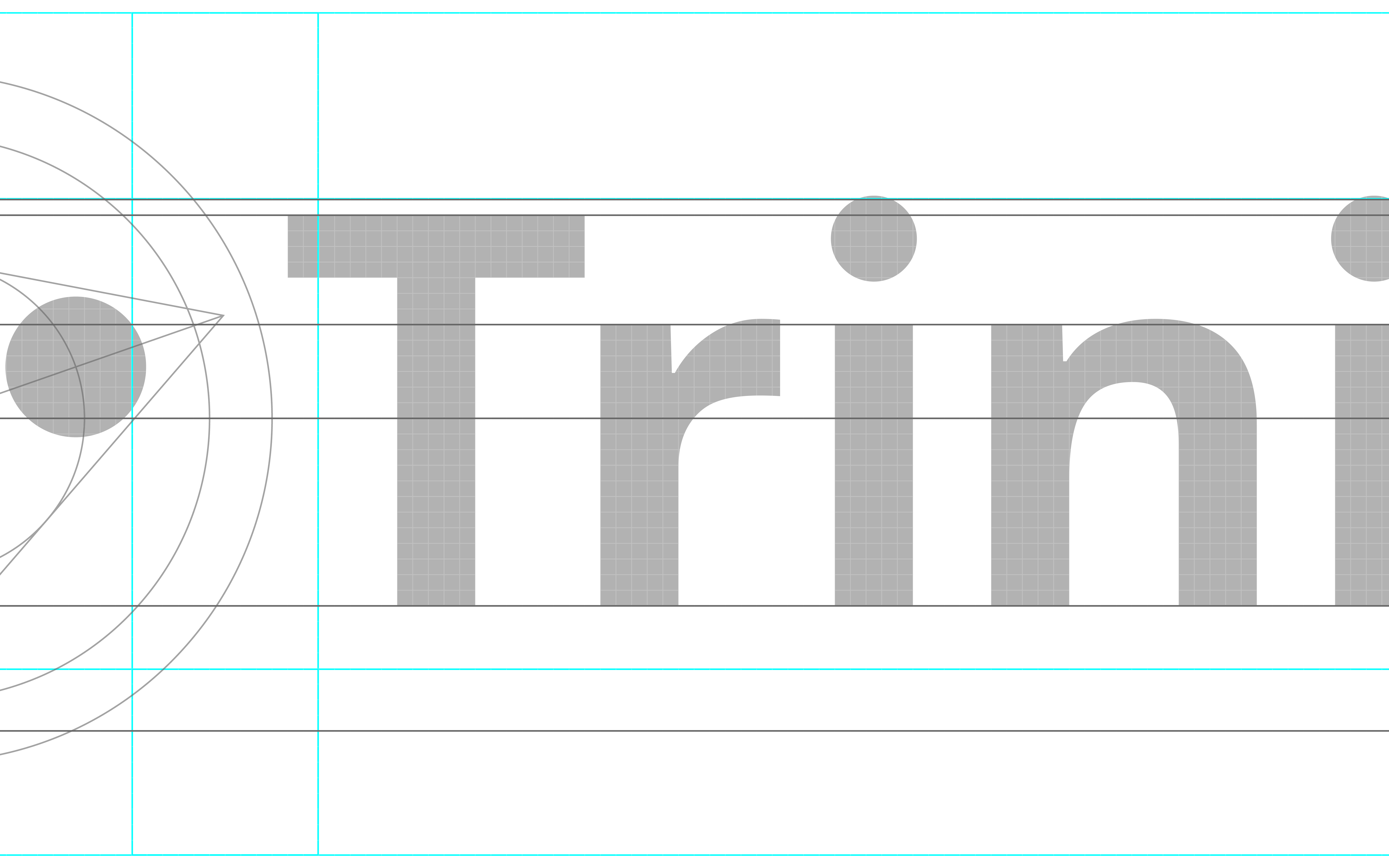
The letterforms and marks are constructed on a grid for balance and sharp on-screen scaling.
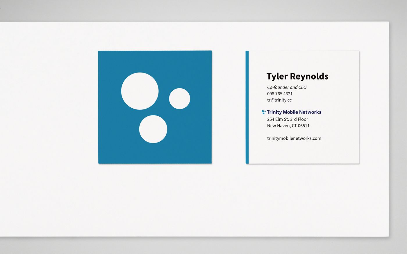
The new marks were accompanied by a new company voice and visual identity system.
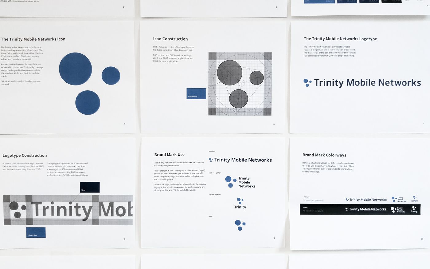
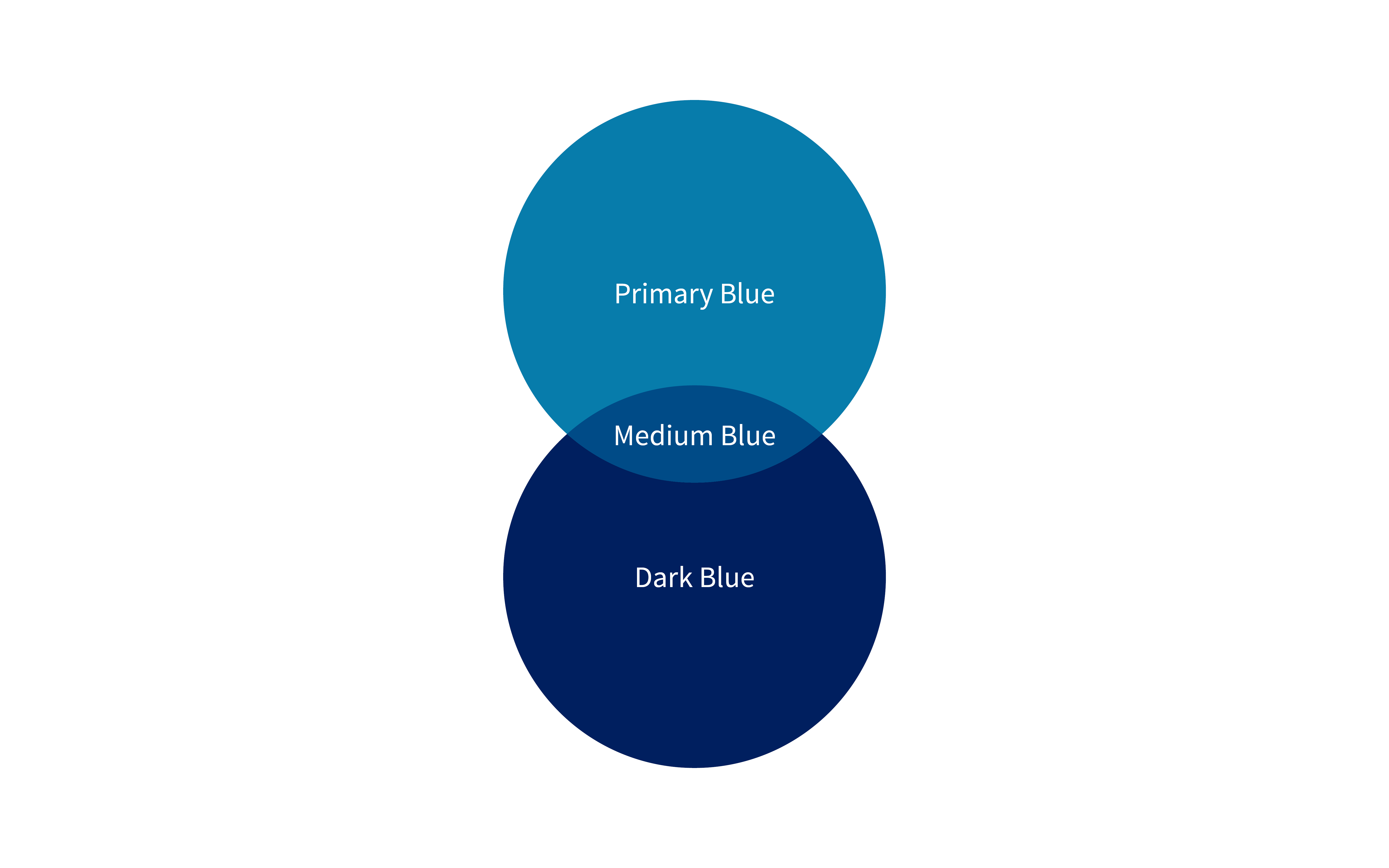
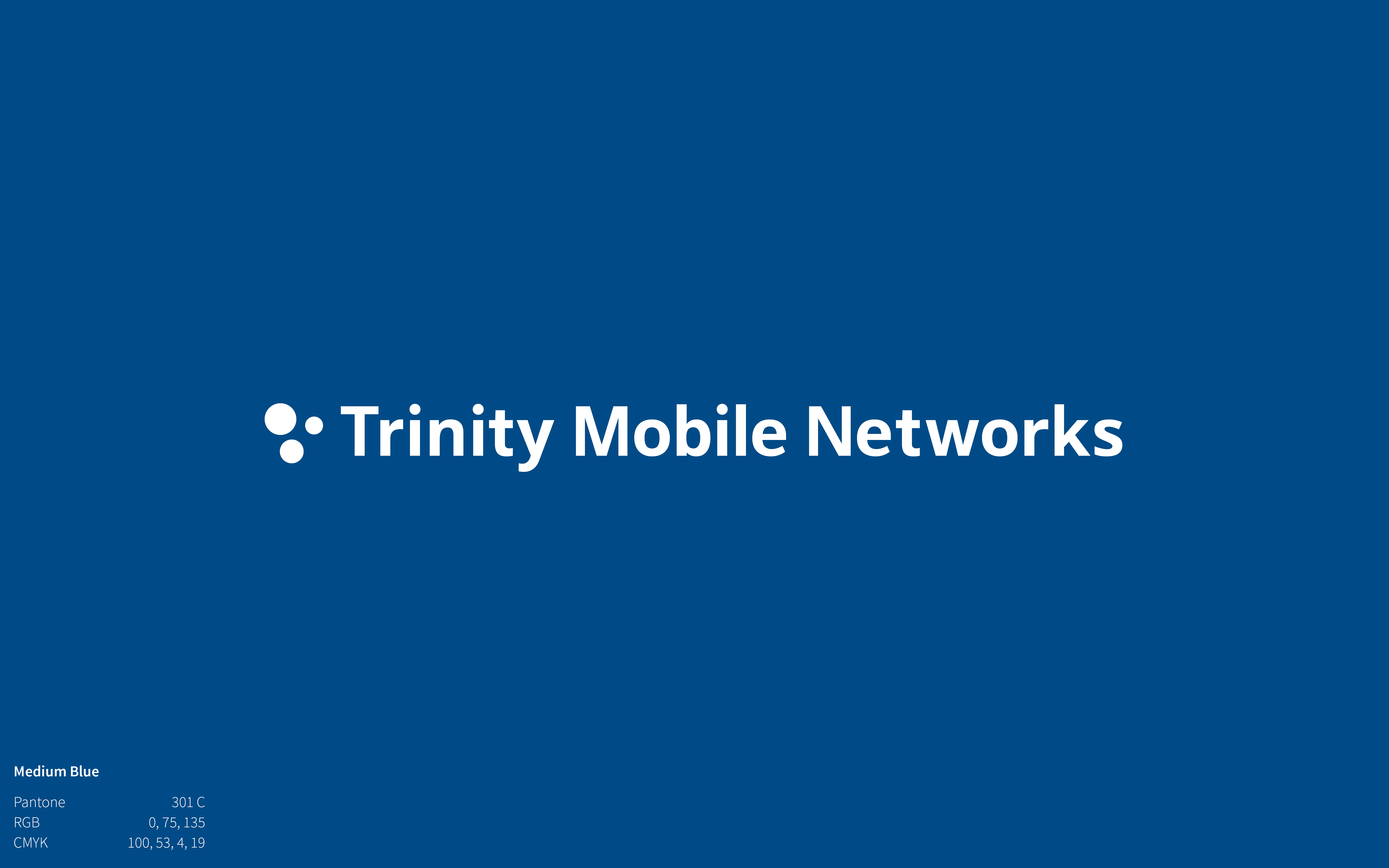
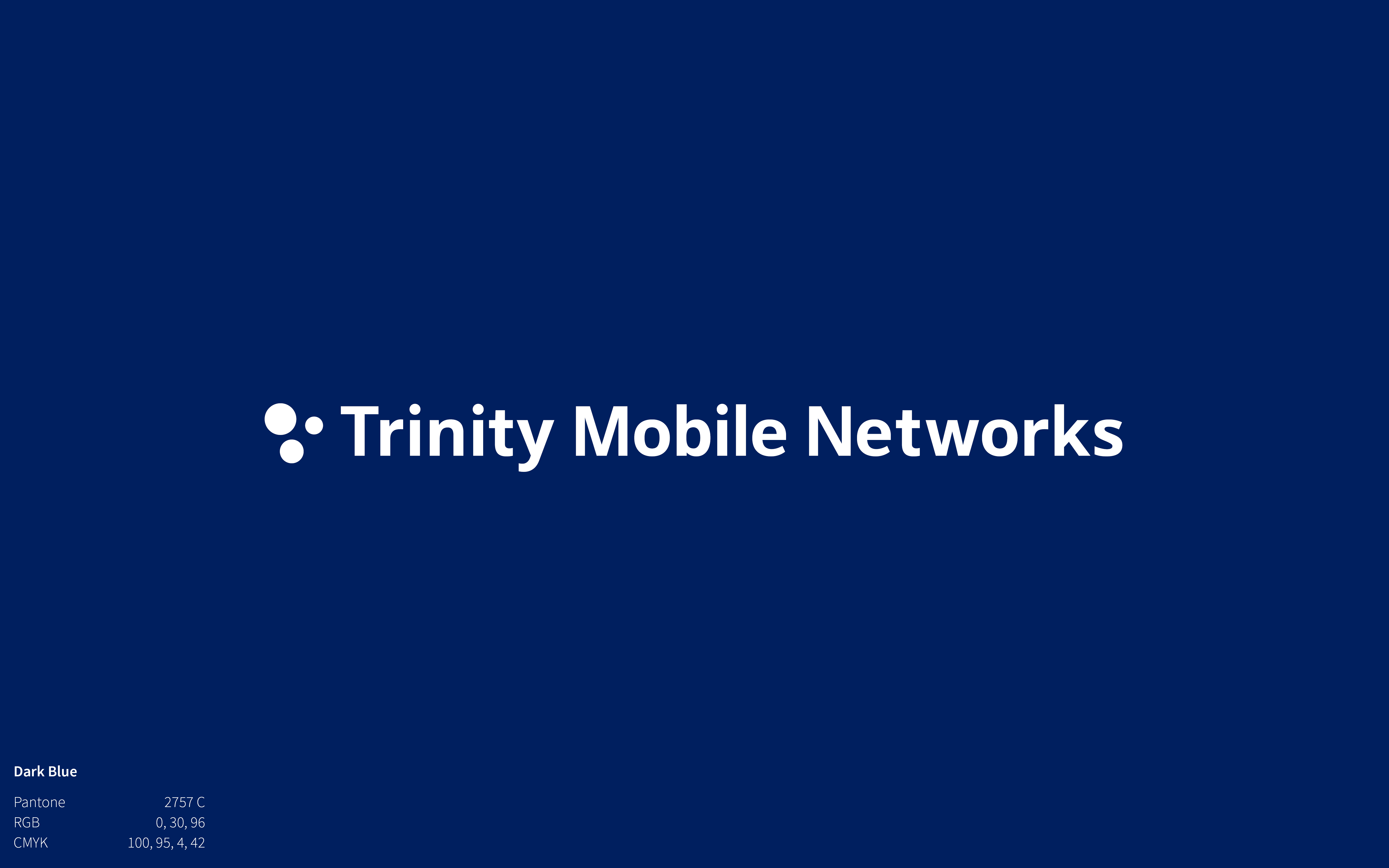
Trinity's Primary Blue echoes the blue of their old mark but is darkened slightly for clarity. The new mark uses the Primary Blue and Dark Blue. Equal mixing of these two blues produced a third blue, Medium, which we use in typography and illustration.
Trinity Mobile Networks is a company invested in providing an accessible internet. I chose Source Sans Pro, an open source typeface, because it aligned with the company values of accessibility, honesty, and innovation.